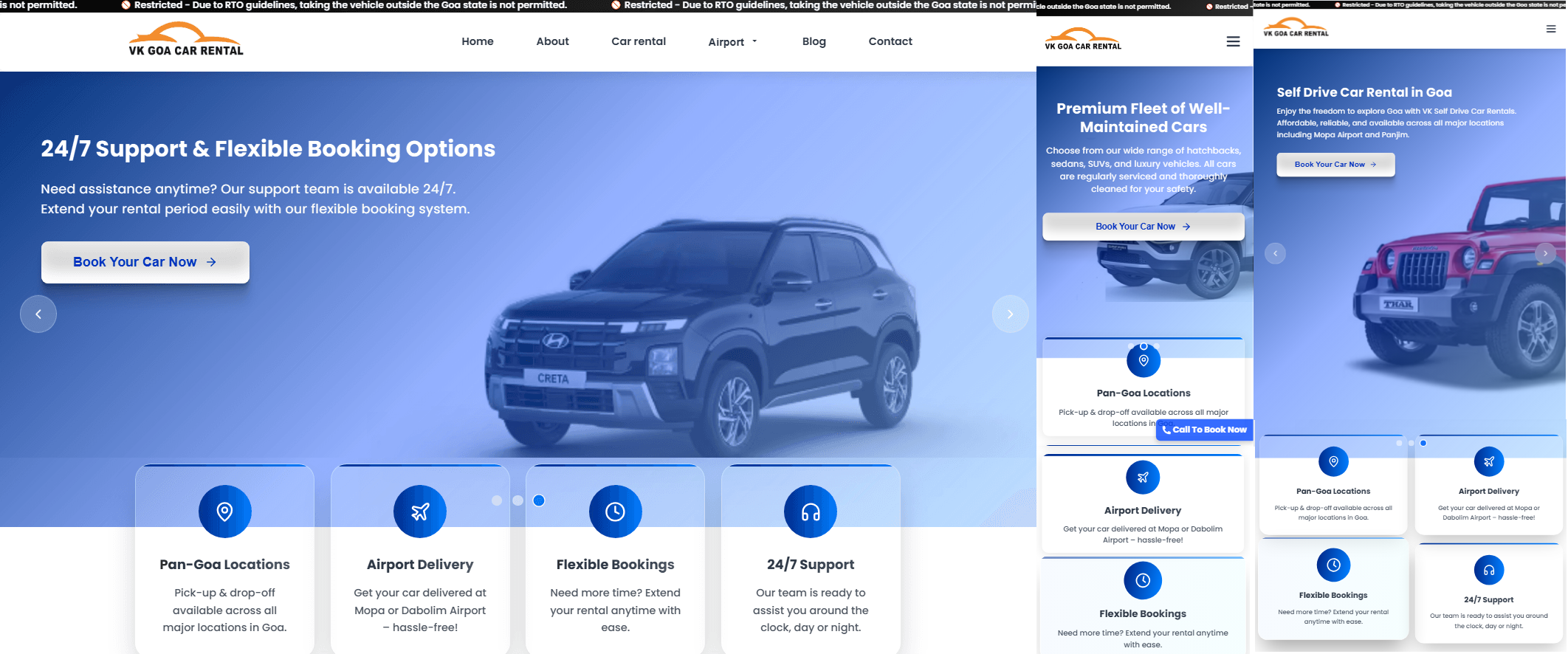
Responsive Web Design

In today's world where everyone uses more than one device, the need to create responsive designs should not even be a discussion—it should be the norm. This is because more than 54% of web traffic comes from mobile devices.
The Evolution of Responsive Design
Responsive web design has come quite a distance in earnest since Ethan Marcotte The term was first coined in 2010 by Rivera et al. An approach that originated merely as a approach that relied on fluid grids and media queries has now evolved into a Complex art that also includes CSS Grid, Flexbox, and modern JavaScript frameworks.
Core Principles of Modern Responsive Design
Mobile-First Approach
Start designing for the smallest screen and progressively enhance for larger devices. This ensures core content is accessible to all users.
Performance First
Responsive design must consider performance. Use adaptive images, lazy loading, and code splitting to maintain fast load times.
User-Centric
Design for real users and their contexts. Consider touch targets, readable text sizes, and intuitive navigation patterns.
Modern Techniques and Best Practices
1. CSS Grid and Flexbox
CSS Grid offers two-dimensional layout features, ideal for complex responsive designs. Flexbox is great for one-dimensional layouts and aligning content. Using both gives developers strong tools for building adaptable interfaces.
.container {
  display: grid;
  grid-template-columns: repeat(auto-fit, minmax(300px, 1fr));
  gap: 1rem;
}
2. Container Queries
The innovative @container rule enables elements to adjust according to the size of their container instead of the viewport. This makes responsive design genuinely modular and component-driven.
Performance Considerations
Responsive design impacts performance significantly. Here are key metrics to monitor:
The Future of Responsive Design
Looking ahead, we're moving toward more intelligent, context-aware designs. Artificial intelligence and machine learning will play larger roles in adaptive interfaces. Features like:
- Adaptive Color Schemes: Based on ambient light and user preferences
- Motion Adaptation: Reduced motion for accessibility
- AI-Powered Layouts: Dynamic content arrangement based on user behavior
- Cross-Device Continuity: Seamless experiences across multiple devices
Conclusion
The way things look on websites is changing. Responsive design is getting better and better. It is not, about how things are laid out on the page anymore. Responsive design continues to evolve it is moving beyond layout. adjustments to become a comprehensive approach to user experience across all devices. By embracing modern techniques and maintaining a We should focus on the performance of the web and the accessibility of the web. This will help us create a web. The performance of the web and the accessibility of the web are very important. We need to make sure the web is easy to use and works well. * The performance of the web is important * The accessibility of the web is also important We can create a web by focusing on the performance of the web and the accessibility of the web. experiences that are not only responsive but truly resilient and user-centric.
