Build a Portfolio Website Using HTML, CSS, and JavaScript

Your portfolio website is your digital business card in today's competitive tech landscape. In this comprehensive guide, we'll build a modern, responsive portfolio from scratch using only HTML, CSS, and vanilla JavaScript—no frameworks required.
Why Build Your Own Portfolio?
While templates and website builders are convenient, building your portfolio from scratch demonstrates your coding skills, allows complete customization, and gives you full control over performance and SEO. This project will showcase your abilities in the three core web technologies that every frontend developer must master.
Skill Demonstration
Shows potential employers your actual coding abilities, not just your ability to use a template.
Complete Control
Full customization over design, animations, and functionality without template limitations.
Performance Optimization
Zero framework overhead means faster load times and better Core Web Vitals scores.
Project Structure & Setup
Let's start by organizing our project files efficiently:
File Structure
portfolio-website/
├── index.html
├── styles/
│   ├── main.css
│   ├── responsive.css
│   └── animations.css
├── scripts/
│   └── main.js
├── assets/
│   ├── images/
│   ├── icons/
│   └── projects/
└── README.md
HTML5 Boilerplate
Start with a semantic HTML5 structure:
<!DOCTYPE html>
<html lang="en">
<head>
    <meta charset="UTF-8">
    <meta name="viewport" content="width=device-width, initial-scale=1.0">
    <title>Your Name | Portfolio</title>
    <link rel="stylesheet" href="styles/main.css">
    <link rel="preconnect" href="https://fonts.googleapis.com">
    <link rel="icon" type="image/x-icon" href="assets/favicon.ico">
</head>
<body>
    <!-- Navigation -->
    <nav class="navbar">
        <!-- We'll build this in CSS/JS -->
    </nav>

    <!-- Main Content -->
    <main>
        <!-- Sections will go here -->
    </main>

    <!-- Footer -->
    <footer>
        <!-- Footer content -->
    </footer>

    <script src="scripts/main.js"></script>
</body>
</html>
Key Components to Build
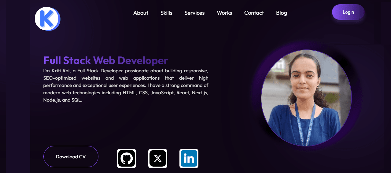
1. Hero Section
Create an impactful first impression with your name, title, and a call-to-action. Include subtle animations to draw attention.
2. Projects Gallery
Showcase 3-5 of your best projects with images, descriptions, technologies used, and links to live demos/GitHub.
3. Skills Section
Display your technical skills with progress bars or category grouping. Keep it visual and easy to scan.
4. Contact Form
Build a functional contact form with validation. Connect it to a service like Formspree or Netlify Forms.
Modern CSS Techniques
CSS Grid for Layout
Use CSS Grid for complex layout sections like the projects gallery:
.projects-grid {
    display: grid;
    grid-template-columns: repeat(auto-fit, minmax(300px, 1fr));
    gap: 2rem;
    padding: 2rem 0;
}

.project-card {
    background: var(--card-bg);
    border-radius: 12px;
    overflow: hidden;
    transition: transform 0.3s ease, box-shadow 0.3s ease;
}

.project-card:hover {
    transform: translateY(-5px);
    box-shadow: 0 10px 30px rgba(0,0,0,0.15);
}
Flexbox for Alignment
Use Flexbox for navigation and skill bars:
.navbar {
    display: flex;
    justify-content: space-between;
    align-items: center;
    padding: 1rem 5%;
    position: fixed;
    width: 100%;
    top: 0;
    z-index: 1000;
}

.skill-bar {
    width: 100%;
    height: 8px;
    background: #e0e0e0;
    border-radius: 4px;
    overflow: hidden;
    margin-top: 0.5rem;
}

.skill-progress {
    height: 100%;
    background: linear-gradient(90deg, var(--primary), var(--secondary));
    transition: width 1.5s ease-out;
}
CSS Variables for Consistency
:root {
    --primary: #2563eb;
    --secondary: #7c3aed;
    --text: #1f2937;
    --light-text: #6b7280;
    --bg: #ffffff;
    --card-bg: #f8fafc;
    --shadow: 0 4px 6px rgba(0,0,0,0.1);

    /* Typography */
    --font-main: 'Inter', system-ui, sans-serif;
    --font-mono: 'Fira Code', monospace;
}

@media (prefers-color-scheme: dark) {
    :root {
        --text: #f9fafb;
        --light-text: #d1d5db;
        --bg: #111827;
        --card-bg: #1f2937;
    }
}
JavaScript Functionality
Smooth Scrolling
Implement smooth navigation between sections with scroll behavior polyfill for cross-browser compatibility.
Form Validation
Create real-time form validation with helpful error messages and success feedback.
Interactive Elements
Add interactive features like project filtering, dark mode toggle, and animated skill bars on scroll.
JavaScript: Smooth Scroll Implementation
// Smooth scrolling for navigation links
document.querySelectorAll('a[href^="#"]').forEach(anchor => {
    anchor.addEventListener('click', function (e) {
        e.preventDefault();
        const targetId = this.getAttribute('href');
        if(targetId === '#') return;

        const targetElement = document.querySelector(targetId);
        if(targetElement) {
            window.scrollTo({
                top: targetElement.offsetTop - 80,
                behavior: 'smooth'
            });
        }
    });
});

// Intersection Observer for animations
const observerOptions = {
    threshold: 0.1,
    rootMargin: '0px 0px -50px 0px'
};

const observer = new IntersectionObserver((entries) => {
    entries.forEach(entry => {
        if(entry.isIntersecting) {
            entry.target.classList.add('animate-in');
        }
    });
}, observerOptions);

// Observe elements for animation
document.querySelectorAll('.skill-bar, .project-card').forEach(el => {
    observer.observe(el);
});
Responsive Design Checklist
Mobile-First Media Queries
/* Base styles (mobile first) */
.container {
    padding: 1rem;
    width: 100%;
}

.nav-menu {
    display: none;
}

/* Tablet */
@media (min-width: 768px) {
    .container {
        padding: 2rem;
        max-width: 720px;
        margin: 0 auto;
    }

    .projects-grid {
        grid-template-columns: repeat(2, 1fr);
    }
}

/* Desktop */
@media (min-width: 1024px) {
    .container {
        max-width: 1200px;
        padding: 2rem 4rem;
    }

    .projects-grid {
        grid-template-columns: repeat(3, 1fr);
    }

    .nav-menu {
        display: flex;
    }

    .hamburger {
        display: none;
    }
}
Performance Optimization
- Image Optimization: Use WebP format with JPEG/PNG fallbacks. Implement lazy loading with the
loading="lazy"attribute. - Code Splitting: Separate CSS for critical and non-critical styles. Use
preloadfor essential resources. - Minification: Minify HTML, CSS, and JavaScript files for production. Remove unused CSS with tools like PurgeCSS.
- Caching: Implement proper cache headers and consider Service Workers for offline functionality.
Deployment Options
GitHub Pages (Free)
Perfect for beginners. Push your code to a GitHub repository and enable GitHub Pages in settings.
Netlify (Free Tier)
Drag-and-drop deployment with continuous deployment from Git. Includes forms, analytics, and HTTPS.
Vercel (Free Tier)
Excellent performance with edge network. Automatic SSL and easy integration with modern frameworks.
Next Steps & Enhancement Ideas
Once your basic portfolio is live, consider these enhancements: Add a blog section to showcase your knowledge, implement a dark/light mode toggle, integrate a CMS like Sanity or Strapi for easy content updates, add performance monitoring with Google Analytics, or implement PWA features for app-like experience. Remember to regularly update your portfolio with new projects and skills—a stagnant portfolio is almost as bad as no portfolio at all!
Your portfolio is never truly "finished." It's a living document of your growth as a developer. Start simple, ship quickly, and iterate based on feedback and new skills you acquire.
